Smart design isn’t just pretty — it solves problems, saves time, and drives real results.
Our Approach
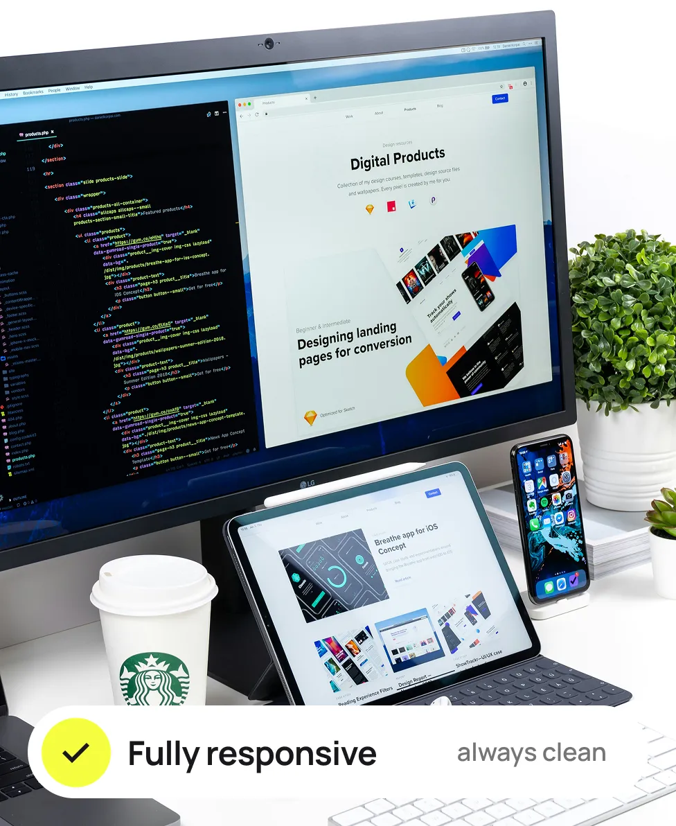
WE DON’T JUST FIT — WE ADAPT
Our approach to responsive web design is rooted in flexibility and consistency. We ensure your content looks and works beautifully across all screen sizes — from desktop to mobile — without compromising usability or aesthetics.
We create responsive layouts that scale across screen sizes. Your site stays sharp and functional.
Touch & Cursor Ready
All components work with both mouse and touch. The experience feels seamless across devices.
Accessibility in Mind
Our designs follow accessibility standards to ensure inclusivity. Everyone can navigate and interact easily.
Consistent Visual Language
Reusable components, clear rules, and scalable patterns that ensure design stays consistent and efficient.
How We Work
We’re a small team — and that’s our strength
When you work with UXON.ME, there’s no middle layer, no miscommunication, and no wasted time. You talk directly to the people who design, animate, and build your product.
01.
Faster feedback loops
No waiting weeks for a response or approval.
02.
Clearer understanding
Fewer people = fewer misunderstandings.
03.
Smarter budgets
You pay for the work, not the overhead.
04.
Sharper results
Every decision is intentional, every pixel considered.
We don't overcomplicate. We listen, plan, create, and deliver


